Output
The FloodAdapt Output tab displays flood and impact maps, time series of water levels at observation points, a tabulated summary of metrics, and a visual infographic for simulated scenarios to help users understand and evaluate their scenarios. The output for event scenarios and risk scenarios differs slightly, but output for both types of scenarios is accessible from the Output tab. FloodAdapt additionally places scenario output locally on your computer in an Output folder within your FloodAdapt database.
FloodAdapt output tab
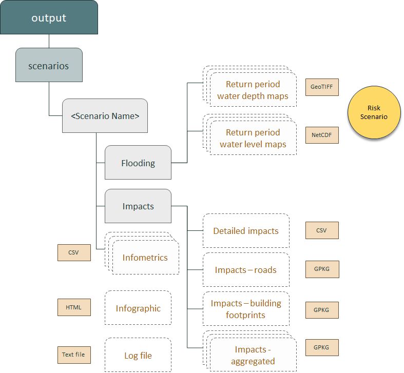
The Output tab has a map window and below it a panel (see Figure 1). The left section of the panel contains a scenario table with the scenarios that have been simulated. These can be sorted by name, date created, or by scenario components (event, projection, strategy). Selecting a scenario in this panel will load the output results for that scenario. The middle section of the panel contains different map visualization options, and the right section contains tabulated metrics. The collapsible frame on the Output tab can be used to view the scenario infographic (see Figure 2 and Figure 3). Note that the creation of the infographic is optional (specified at system setup). When an infographic is not configured for a site, the collapsible frame will display the documentation instead of the infographic.
The infographic is visible in the map window’s collapsible frame. The user can view the infographic by clicking the little white triangle on the border of the frame to the right of the map window (see Figure 1).
Metrics and infographic
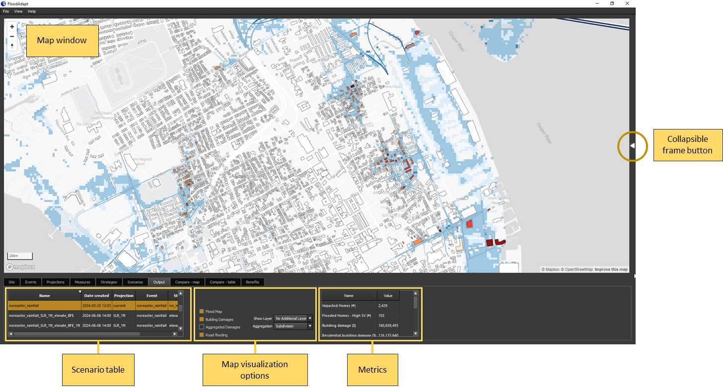
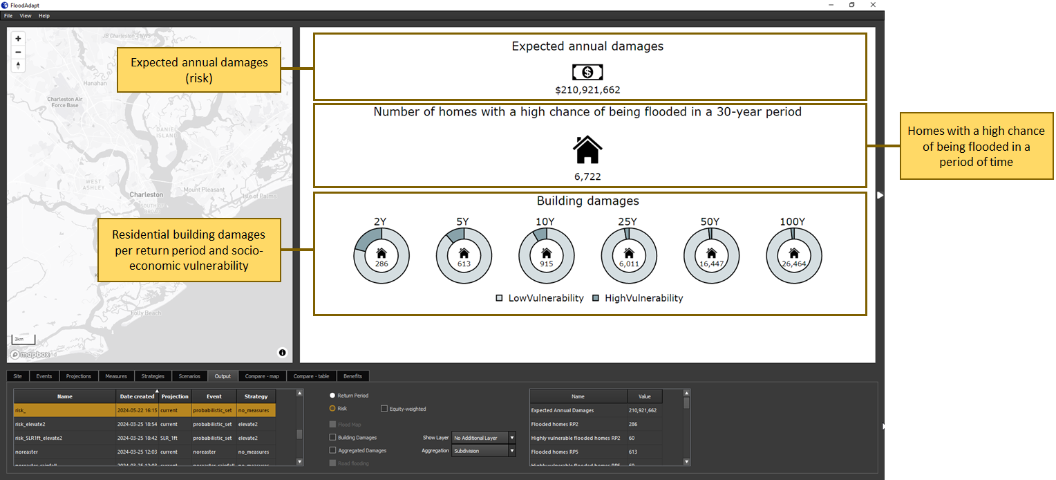
The metrics and infographic will contain different information for a risk scenario and an event scenario. This information is configured separately for event scenarios and risk scenarios at system set-up (see information on how the infometrics and infographic are configured in the setup guide). Figure 2 shows an example of the infographic for an event scenario and Figure 3 shows an example of the infographic for a risk scenario. The basic structure of the infographic, highlighted in the figures, is fixed but the information within that structure can be tailored at system setup.

Time series at observation points
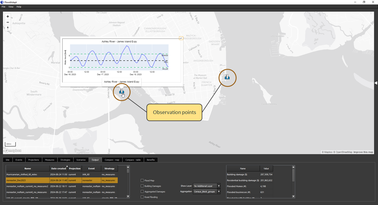
If observation points have been configured for a site (these are optional), the time series of modeled water levels at these points can be viewed by clicking on the observation points in the map window (see Figure 4). A graph window will pop up and show the modeled water level time series over the duration of the event. If one of the observation points is located at a water level gauge, the measured water levels will also be displayed. To make the time series popup disappear, click anywhere else in the map window.
Map visualization options for an event scenario
When an event scenario is selected in the scenario panel, there are four map visualization options (see Figure 1). Clicking the check boxes next to any of these four options will display the corresponding layer in the map window.
- Flood map - shows the extent and depth of flooding for the scenario.
- Building damages - displayed as a heat map when zoomed out (this helps identify which areas are interesting to look at in more detail). Zooming in transitions the heat map to a display of building-level damages.
- Aggregated damages - show the damages summed up over different areas, such as census blocks or neighborhoods. The areas will correspond to the aggregation areas that are shown in the site tab; these areas are specified at system setup. The aggregation drop-down menu to the right of the “Aggregated damages” check box can be used to switch between different areas.
- Road flooding - shows the water depth on the roads.
In addition to the four map layers, there is also the option to select an additional layer to view in the map window. This is found in the “Show Layer” drop-down menu. The specific layers available will depend on how the system was configured at setup, but could contain layers like income, social vulnerability index, or aggregation areas. These layers are often useful to visualize in combination with building level damages or flooding, to better understand who is being impacted in the scenario.
The building-level damages show what appear to be precise damage amounts; for example, a building could show $67,233 of damage. In reality, there is uncertainty around this estimate. The uncertainty stems from multiple sources including the accuracy of the flood map at the building location, the correctness of the depth-damage curve for the building, and the accuracy of the exposure data (such as building value or finished floor height). At this moment, uncertainty bands are not provided with the damage estimates in FloodAdapt, but it is important to be aware that these values are not as precisely known as they appear.
It is possible to have all the map layers visible at the same time, but we recommend turning off the other layers when selecting aggregated damages. It makes for a cleaner map!
Map visualization options for a risk scenario
A risk scenario calculates return period flooding and damages, and also combines this information to calculate risk in terms of expected annual damages. The risk scenario map visualization options allow users to view both return period and risk output.
When a risk scenario is selected, two radio buttons will appear: “Return period” and “Risk” (see Figure 5). If you select “Return period”, a drop-down window appears from which you can select a return period for which you want to view output. For individual return periods, the map visualization options are identical to those for the event scenario.
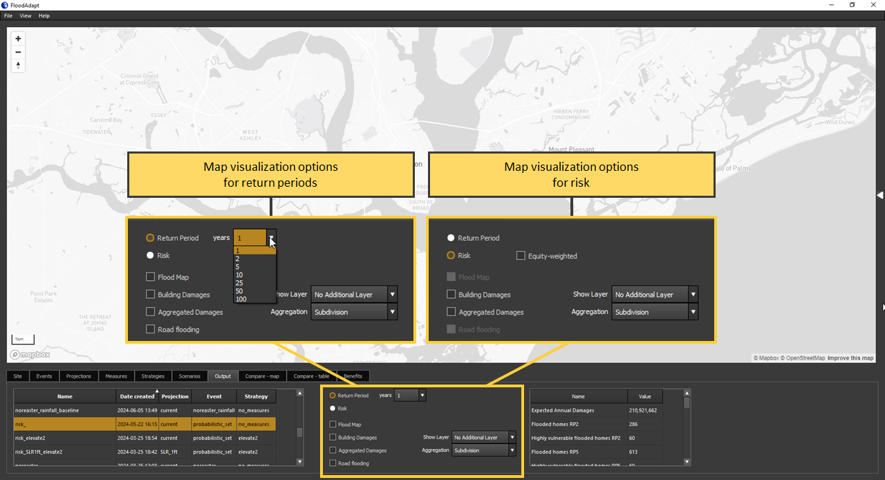
When the “Risk” radio button is selected (see Figure 5), two map layers can be viewed:
- Building damages - these damages represent the annual expected damages. When zoomed out this layer is displayed as a heat map (this helps identify which areas are interesting to look at in more detail). Zooming in transitions the heat map to a display of building-level expected annual damages.
- Aggregated damages - this layer shows the expected annual damages (risk) summed up over different areas, such as census blocks or neighborhoods. The aggregation drop-down menu to the right of the “Aggregated damages” check box can be used to switch between different areas.
There are a couple of special notes about the map visualization options for risk results compared to the return period or event scenario results:
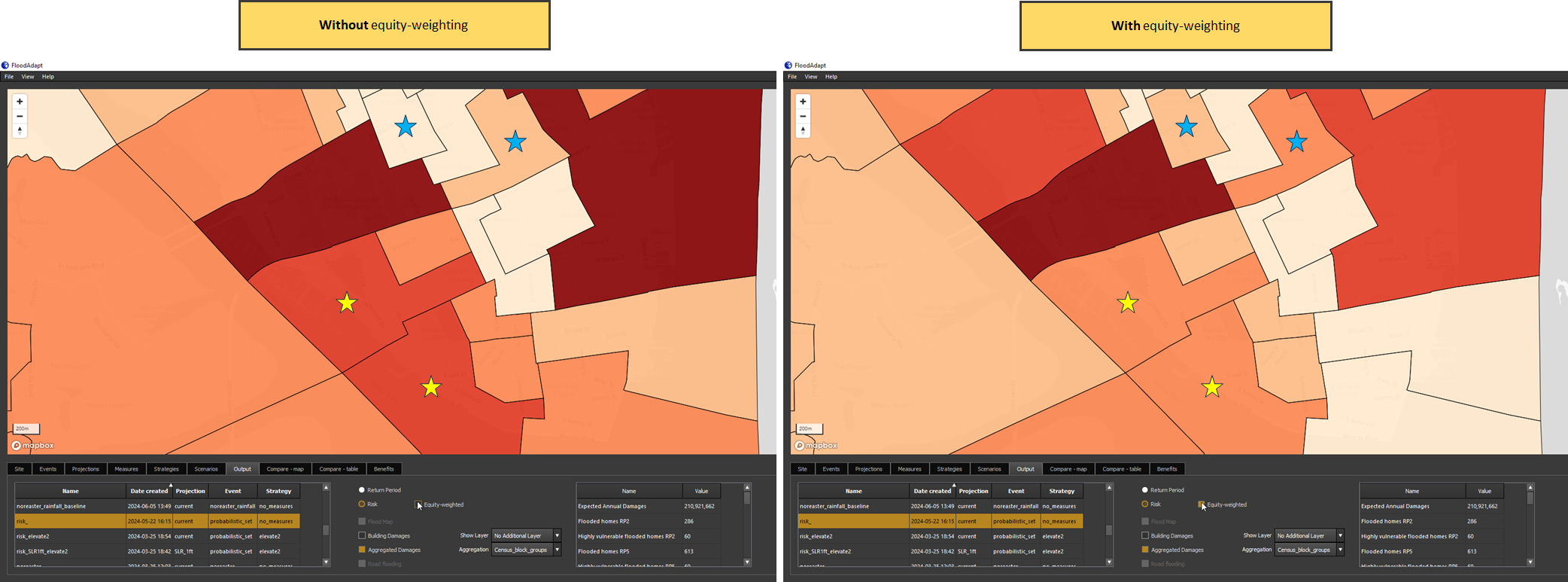
Equity weighting
Next to the Risk radio button there is a checkbox “Equity-weighted”. Checking it allows users to see equity-weighted risk estimates. Equity weights are calculated in FloodAdapt using information on income. These weights are then multiplied by the damages to derive the equity-weighted risk estimates. This visualization is only available at the same scale for which income data is available. This will typically be census block level. Figure 6 shows the difference with and without equity weights, highlighting how it affects low-income and high-income neighborhoods. The low income neighborhoods are represented with blue stars and the high-income with yellow stars. Note that the equity-weighted risk for the low-income neighborhoods is higher than the risk when equity weights are not used.
No flood maps
In the case of risk results, the flood map and road flooding options are disabled because risk is a damage metric that is integrated over several different flood events, and does not correspond to any single flood event.
In addition to the output map layers, there is also the option to select an additional layer to view in the map window. This is found in the “Show Layer” drop-down menu. The specific layers available will depend on how the system was configured at setup, but could contain layers like income, social vulnerability index, or aggregation areas. These layers are often useful to visualize in combination with building level (expected annual) damages, to better understand who is being impacted in the scenario.
Output folder
The output from a simulated scenario is saved on a user’s computer, aspiring to provide full access and transparency. This section will describe the output folder structure for both an event and a risk scenario.
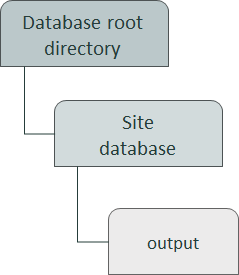
Figure 7 shows where the output folder is located within the FloodAdapt database. The database root directory could contain multiple site databases, for different locations, or even variations of databases for the same location. The output folder is located directly inside the site database folder.
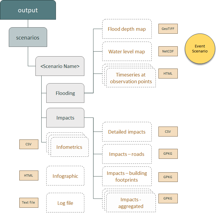
The output folders for the event scenarios and risk scenarios have mostly the same structure; they only differ in the output flood data. Figure 8 shows the output structure for an Event scenario and Figure 9 shows the output structure for a Risk scenario.
The output folder contains a subfolder named “scenarios”. Within this subfolder you will find one folder for each scenario that has been simulated. The name of the folder will be the name of the scenario. Each scenario folder will contain two subfolders: “Flooding” and “Impacts”. It will also contain the infographic as an HTML file, a log file with details about the simulation, and the infometrics as CSV files; there will be one CSV for buildling-level metrics and one CSV per aggregation area (e.g. neighborhood or census block group) with aggregated metrics.
The “Impacts” folder will contain multiple files:
- Detailed impacts (CSV file) with asset-level information on the assets and their impacts
- Impacts on the buildings, as a geopackage (GPKG) file.
- Aggregated impacts, one GPKG file for each aggregation area (e.g. neighborhoods or census block groups)
- Impacts on the roads (GPKG file). Note that these “impacts” are actually inundation depth on the roads.
For the risk scenarios, the detailed impacts (CSV file) will have both return period damages and risk per asset. The Impacts on the buildings and the aggregated impacts (GPKG files) will similarly contain return period damages and expected annual damages. For the impacts on the roads (GPKG file), the output will contain the inundation depth on the roads for the different return periods.
Output folder structure for an event scenario
For an event scenario, the “Flooding” folder will contain a flood depth map as a GeoTIFF file, a water level map as a NetCDF, and (if observation points have been set up for the site) the water level time series for each observation point at the site, as HTML files (see Figure 8).
Output folder structure for a risk scenario
For a risk scenario, the “Flooding” folder will contain the return period water level maps as NetCDF files and the water depth maps as GeoTIFFs (see Figure 9).